The secret to a clean iPhone screen isn’t about finding the prettiest widgets; it’s about applying intentional design principles to create a context-aware, functional interface.
- Treat your Home Screen as a piece of information architecture, where every element has a purpose and reduces cognitive load.
- Leverage Focus Modes to create layered privacy and context, showing only the information you need, when you need it.
Recommendation: Instead of adding more widgets, start by auditing your daily routines and build thematic « briefing stacks » for specific moments like morning, work, or evening.
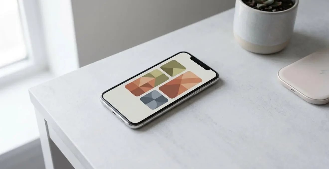
Your iPhone Home Screen has likely devolved into a chaotic grid of app icons, a digital junk drawer that induces stress rather than providing clarity. The common advice—create widget stacks, use Smart Rotate, try Widgetsmith—often adds to the visual noise instead of solving the core problem. Many users attempt to stack their favorite apps, only to create a jumble of unrelated information that is neither beautiful nor functional. This approach treats customization as mere decoration, failing to address the underlying issue of digital overload.
But what if the solution wasn’t about adding more, but about being more intentional? A truly effective Home Screen isn’t a gallery of colorful widgets; it’s a masterpiece of information architecture. As a digital minimalism design consultant, I see the Home Screen not as a container for apps, but as a dynamic, context-aware interface. The goal is to transform it from a source of distraction into a purpose-driven tool that anticipates your needs and protects your focus.
This guide will walk you through the design principles needed to achieve this. We won’t just cover the « how » of creating stacks; we’ll explore the « why » behind strategic widget selection, privacy layering with Focus Modes, and training your iPhone’s intelligence. It’s time to stop decluttering and start designing.
This article provides a structured approach to reclaiming your digital space. Follow along as we break down the key strategies for designing a truly smart and minimalist Home Screen.
Summary: A Strategic Guide to iOS Home Screen Design
- Weather or Calendar: Which Widget Should Be on Your First Screen?
- How to Hide Your Banking Widget Inside a Photo Frame Stack?
- Widgetsmith vs Native Options: Is Customisation Worth the Battery Drain?
- The Long-Press Mistake That Deletes Your Carefully Curated Stack
- How to Stop Smart Rotate From Showing You Photos During a Meeting?
- How to Show a « Work Tasks » Stack Only When You Are at the Office?
- The « Fat Finger » Problem: Why Your Buttons Must Be at Least 44px High?
- Smart Stacks: How to Make Your iPhone Suggest the Right App at 9 AM?
Weather or Calendar: Which Widget Should Be on Your First Screen?
The choice for the prime real estate on your Home Screen isn’t trivial; it’s the first decision in your new information architecture. The question isn’t « which is better, » but « which serves your immediate context? » A Calendar widget is ideal for a schedule-driven day filled with meetings, providing a static, low-energy overview of your commitments. Its data rarely changes, making it efficient and predictable.
In contrast, a Weather widget serves a reactive need, perfect for when your plans depend on changing conditions. However, this convenience comes at a cost. Because they require constant GPS and network access for updates, weather widgets can create substantial battery drain. According to research on widget battery consumption, widgets that frequently refresh in the background are among the most power-hungry.
The optimal solution is often to refuse the binary choice. Instead of dedicating the space to one, build a « Morning Briefing » Smart Stack. Combine the Weather, Calendar, and Reminders widgets into a single, thematic hub. This allows you to get a comprehensive, glanceable overview of your day ahead. With Smart Rotate enabled, your iPhone will learn to surface the most relevant of the three based on your routine, giving you the best of both worlds without permanently sacrificing screen space or making a hard choice.
This approach moves you from a static layout to a dynamic one, where the information presented is tailored to the moment. It’s the first step toward a truly intelligent and personalized interface.
How to Hide Your Banking Widget Inside a Photo Frame Stack?
The question itself reveals a common but flawed approach to digital privacy: security through obscurity. While technically you could bury a sensitive widget in a stack, it’s an insecure and clumsy solution. A single accidental swipe could expose your financial data. A true design consultant doesn’t hide information; they control its context. The far superior solution lies in creating robust privacy layers using Focus Modes.
Instead of one Home Screen trying to be everything, design multiple Home Screens for different contexts. For example, create a « Public » or « Default » Home Screen with aesthetic, non-sensitive widgets like clocks, photos, or music. This is the screen that is safe for « shoulder-surfing » scenarios in a café or on public transit.
As this visual metaphor suggests, true privacy is about controlling visibility through deliberate layers. You then create a separate, hidden « Private » or « Finance » Home Screen page that contains your banking, investment, and budgeting widgets. This entire page is then linked to a specific Focus Mode—let’s call it « Finance Focus »—that you can activate discretely. This method, often used by power users, provides a powerful digital boundary. It ensures sensitive information is only visible when you have explicitly and intentionally entered a secure context, rather than relying on the hope that no one sees an accidental swipe.
This is the core of context-aware design: your phone’s interface adapts to your intent. The information is not hidden, but gated behind a deliberate action, providing a much more secure and elegant privacy model.
Widgetsmith vs Native Options: Is Customisation Worth the Battery Drain?
The allure of third-party apps like Widgetsmith is undeniable. They promise nearly unlimited customization of fonts, colors, and data displays, allowing for a truly personalized aesthetic. However, this flexibility comes with hidden costs, primarily in battery life and performance. The question isn’t simply whether customization is « worth it, » but rather what specific problem you are trying to solve and what trade-offs you are willing to accept.
Native iOS widgets are engineered for maximum efficiency. They run with minimal background activity and have a negligible impact on device performance. Their limitation is in their rigidity; you are confined to Apple’s pre-defined layouts and data structures. Third-party widgets, on the other hand, often need to pull data from various internet sources and refresh more frequently to provide their rich, personalized information. This constant background activity, especially for widgets requiring internet access and GPS, can lead to a noticeable decrease in battery life.
The decision requires a clear understanding of the value proposition of each, as outlined in a recent comparative analysis of widget performance.
| Aspect | Native iOS Widgets | Third-Party (e.g., Widgetsmith) |
|---|---|---|
| Battery Efficiency | Highly optimized, minimal background activity | Variable; depends on refresh rate and data sources |
| Data Richness | Limited to Apple’s data structure | Extensive customization with rich, personalized data |
| Customization | Pre-defined layouts and styles | Nearly unlimited visual and functional options |
| System Integration | Seamless, automatic updates | May require manual configuration and updates |
| Performance Cost | Negligible impact on device performance | Potential performance trade-off for advanced features |
From a design consultant’s perspective, the best strategy is a hybrid one. Use highly optimized native widgets for essential, high-frequency information like your calendar or clock. Reserve the use of battery-intensive third-party widgets for one or two specific, high-value purposes where deep customization provides a genuine functional benefit, not just an aesthetic one.
The Long-Press Mistake That Deletes Your Carefully Curated Stack
One of the most frustrating moments in Home Screen customization is the accidental deletion of a perfectly arranged widget stack. This happens because of a conflict in user interface muscle memory. On iOS, a long-press typically means « edit » or « rearrange. » However, with widgets, a long-press can bring up a menu where the « Remove Stack » option is dangerously easy to hit. This is the first and most common anti-pattern users fall into.
To become a proficient Home Screen designer, you must understand and avoid these common pitfalls. It’s not just about knowing how to add widgets, but how to manage them effectively without falling into traps that lead to frustration.
Here are the key anti-patterns to recognize and avoid:
- The Accidental Deletion: Your muscle memory tells you to long-press and act. For stacks, the correct, non-destructive path is always to long-press, then deliberately choose ‘Edit Stack’ from the contextual menu that appears. Avoid any direct, reflexive tapping on removal options.
- The « Junk Drawer » Stack: The most common design error is stacking unrelated widgets. Mixing weather, fitness, news, and photos in one stack defeats the purpose of glanceable information. It creates high cognitive load because your brain doesn’t know what to expect. Stacks should always be thematically coherent (e.g., a « Work » stack with Calendar, Tasks, and Email; a « Health » stack with Fitness, Water Intake, and Sleep).
- The Redundant Data Stack: Avoid stacking two different weather widgets or two calendar widgets. This introduces visual confusion and wastes a valuable slot in your stack that could be used for a different type of information.
A proactive strategy is to take a screenshot of your perfectly configured Home Screen pages. If you accidentally delete a complex stack, this visual reference allows you to rebuild it in seconds, turning a moment of major frustration into a minor inconvenience.
How to Stop Smart Rotate From Showing You Photos During a Meeting?
The scenario is a recurring nightmare for professionals: you’re in a crucial meeting, you glance at your phone to check the time, and Smart Rotate decides this is the perfect moment to display a photo from last weekend’s party. While powerful, the « intelligence » of Smart Rotate can be a liability if left completely untamed. Regaining control doesn’t mean disabling the feature, but rather implementing a deliberate, tiered strategy to guide its behavior.
True mastery of your device means understanding that you can, and should, train its algorithms. You must provide the system with clear signals about what is appropriate in a given context. Simply hoping the algorithm gets it right is not a strategy; it’s a gamble. A more professional approach involves proactive curation and contextual control.
Here is a three-tier strategy to manage the Photos widget and Smart Rotate:
- Tier 1 – Train the Algorithm: iOS learns from your behavior. To teach it not to show photos during work hours, make a point of intentionally interacting with your Calendar or Tasks widget just before meetings. Do this for several days in a row. The system uses time, location, and app usage patterns to predict your needs, and this consistent behavior sends a strong signal about what’s relevant during your workday.
- Tier 2 – The Focus Mode Solution: For absolute control, create a « Meeting » or « Work » Focus Mode. This is the power-user solution. Link this Focus Mode to a dedicated Home Screen page that intentionally excludes the Photos widget or any unpredictable Smart Stacks. When the Focus Mode is active, only this curated, professional screen is visible, eliminating any chance of an embarrassing widget rotation.
- Tier 3 – Upstream Curation: The final layer of control happens within the Photos app itself. The widget only pulls from a specific collection of your pictures. Navigate to the Photos app, tap the « For You » tab, and review the « Featured Photos » section. If you see any image that would be inappropriate for a public or professional context, you can tap it and actively select ‘Remove from Featured Photos.’ This prevents the image from ever entering the widget’s rotation pool.
By combining these three tactics, you move from being a passive victim of the algorithm to an active director of your device’s behavior, ensuring your Home Screen is always professional when it needs to be.
How to Show a ‘Work Tasks’ Stack Only When You Are at the Office?
This is the pinnacle of a context-aware Home Screen: an interface that physically transforms based on your location. The goal is to create a seamless transition between your personal and professional digital lives, eliminating the mental overhead of switching contexts manually. By linking a specific Home Screen page to a location-based « Work » Focus, your phone can automatically hide personal distractions and surface your professional tools the moment you arrive at your office.
This isn’t just about hiding games and social media; it’s about reducing cognitive load. When you are at work, you shouldn’t have to hunt for your task manager or see notifications from your hobby apps. Your phone should present a clean, focused, work-centric environment. Conversely, the moment you leave, all traces of work should vanish from your screen, allowing you to be fully present in your personal life. This is the « digital commute » that advanced users create to enforce a healthy work-life boundary, using the phone’s geofencing capabilities to create a powerful digital divide.
Setting this up is a straightforward process that permanently changes how you interact with your device. It’s the ultimate expression of an intentional, minimalist interface.
Your Action Plan: Build a Location-Aware Workspace
- Create a ‘Work’ Focus: Navigate to Settings > Focus and tap the ‘+’ icon to create a new « Work » Focus. During setup, customize which contacts and apps are allowed to notify you. Be strict to protect your concentration.
- Automate with Location: In the Work Focus settings, tap ‘Add Schedule or Automation.’ Choose ‘Location’ and enter your office address. Adjust the geofence radius to be precise, ensuring it activates as you arrive, not a block away.
- Design Your ‘Work’ Home Screen: Go to your Home Screen, swipe to a new, empty page, and enter jiggle mode. Design this page with only your work essentials: a « Work Tasks » widget stack, your work calendar, professional apps like Slack or Teams, etc.
- Link Page to Focus: Return to the Work Focus settings. Under ‘Customize Screens,’ tap the ‘Choose’ button for the Home Screen. Select only the dedicated ‘Work’ page you just created. Now, this will be the only page visible when your Work Focus is active.
- Configure the « Off » State: Create a corresponding « Personal » Focus that does the opposite—hiding your work page when you’re not at the office. This ensures a clean separation when you leave your work location.
Once configured, this system runs itself. Your phone becomes a dynamic tool that adapts to your environment, serving the right information and tools for the context you’re in, without a single manual tap.
The « Fat Finger » Problem: Why Your Buttons Must Be at Least 44px High?
While you are the user, not the developer, understanding a core principle of iOS design will make you a more intentional customizer. This principle is the « fat finger problem, » and it’s why Apple has strict guidelines for the size of any tappable element. It’s the invisible science behind why your phone feels intuitive to use—or frustrating when a developer gets it wrong.
Apple’s Human Interface Guidelines mandate a minimum touch target size of 44×44 points. This isn’t an arbitrary number. It’s based on extensive research into human physiology—specifically, the average size of an adult fingertip. When a button or interactive element is smaller than this, the chance of a mis-tap increases dramatically. In fact, some research based on Apple’s accessibility guidelines demonstrates that touch targets smaller than this standard result in 25% or higher tap error rates, a figure that is even more pronounced for users with motor impairments.
As Apple’s own developer documentation states in a core design principle:
Create controls that measure at least 44 points x 44 points so they can be accurately tapped with a finger.
– Apple Developer, UI Design Dos and Don’ts – Apple Developer Documentation
So, what does this mean for you as a Home Screen designer? When choosing third-party widgets, pay attention to the size of their interactive elements. If a widget packs in dozens of tiny, untappable « buttons, » it might look impressive, but it will be a usability nightmare. It violates a fundamental rule of good design. Prioritize widgets that respect this 44-point rule, offering clean, generously sized tap targets. This ensures your customized Home Screen is not only visually appealing but also functional and frustration-free.
Key Takeaways
- Design with Intentionality: A great Home Screen isn’t about decoration, but about building a goal-oriented information architecture. Every widget must have a clear purpose.
- Leverage Contextual Layers: Use Focus Modes to create distinct Home Screens for different contexts (Work, Personal, Public), ensuring privacy and reducing cognitive load.
- Understand the Trade-Offs: Heavy customization and data-rich widgets come at the cost of battery life and performance. Use them strategically, not universally.
Smart Stacks: How to Make Your iPhone Suggest the Right App at 9 AM?
The ultimate promise of a « smart » device is one that anticipates your needs. On iOS, this promise is delivered through a combination of Smart Stacks and the Siri Suggestions widget. Many users confuse the two, but understanding their distinction is key. A « Smart Stack » is any stack you build yourself where you’ve enabled the « Smart Rotate » feature. The « Siri Suggestions » widget is a pre-built stack that iOS creates and manages for you, surfacing not just apps but also actions.
To make your iPhone suggest your podcast app at 9 AM during your commute, you need to train the algorithm through consistent behavior. The system’s machine learning is not magic; it is a pattern-recognition engine. To train it effectively, you must provide it with a clear, repeatable pattern. Simply open your desired app (e.g., the podcast app) at the desired time (e.g., around 9 AM) for several consecutive days. The algorithm will connect the time, your location (if you’re commuting), and the app usage, and begin to surface that widget proactively.
However, the true power comes from combining this learned behavior with Focus Modes. As noted in analyses of context-aware automation, enabling ‘Smart Activation’ for Focus Modes allows iOS to use its machine learning to decide when a Focus should be turned on. When you link a Smart Stack to a Smartly Activated Focus Mode, you create a fully autonomous system. The device learns that when you arrive at the gym, it should activate your « Workout » Focus, which in turn brings up a Home Screen with your Fitness, Music, and Timer widgets. It’s a system where the interface adapts to your life, not the other way around.
This is the final piece of the puzzle: moving from manually curating your screen to creating a system that curates itself based on the behaviors you’ve intentionally taught it. Your iPhone transforms from a static grid of icons into a dynamic partner that understands your context and serves your goals.
By applying these design principles, you can start today to transform your Home Screen from a cluttered source of distraction into a minimalist, powerful, and truly smart interface. The next logical step is to audit your own screen and begin building your first context-aware stack.