Your beautiful desktop design isn’t just ‘not optimal’ on mobile—it’s actively creating friction that costs you sales before a user even clicks « add to basket. »
- Desktop-first thinking ignores physical ergonomics, leading to frustrating tap errors (the ‘fat finger’ problem) on crucial buttons.
- It promotes hiding key navigation, which increases cognitive load and causes users to abandon their search for products.
Recommendation: Stop auditing for visual bugs and start engineering for mobile-native interactions. Treat every pixel on mobile as a potential point of friction or a path to conversion.
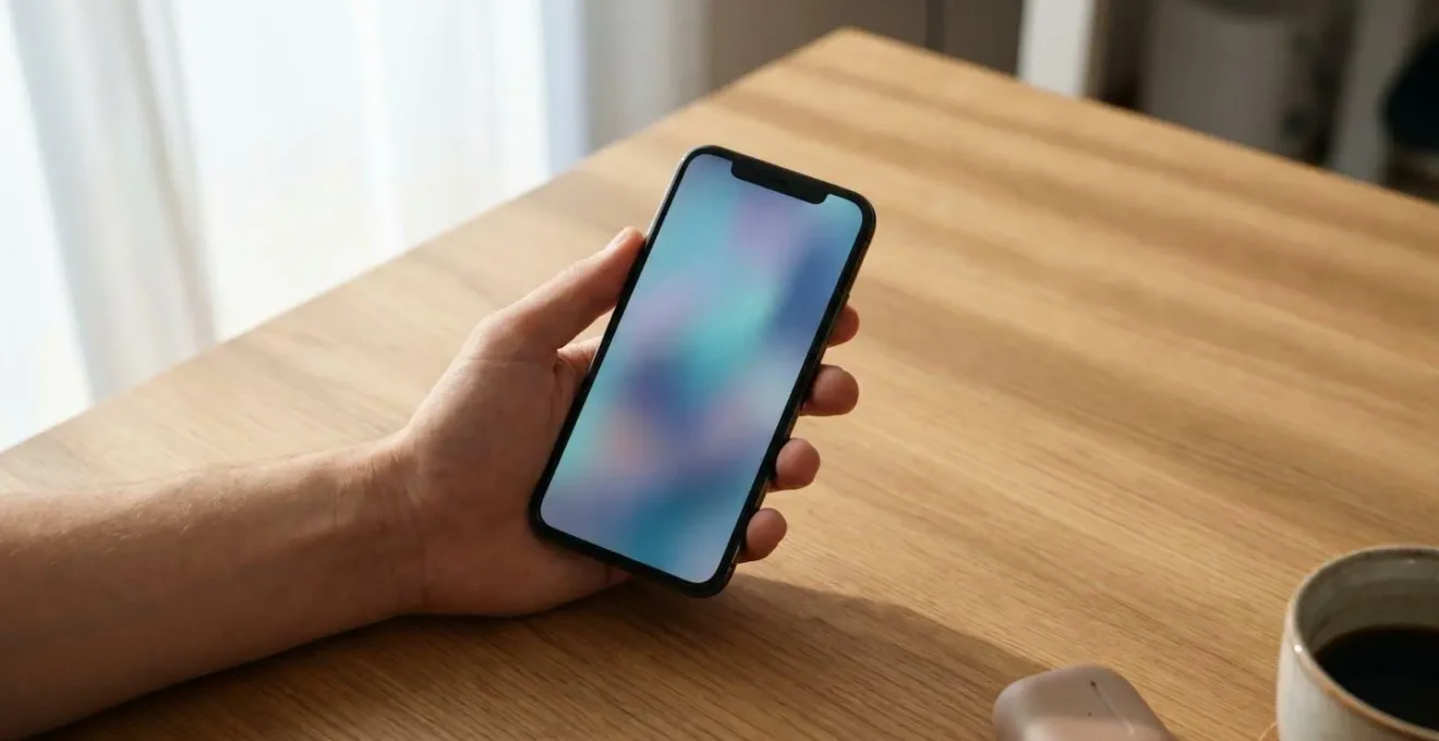
You’ve spent weeks perfecting a stunning e-commerce design on your large desktop monitor. The layout is pixel-perfect, the imagery is crisp, and the branding is on point. Then, you check it on your phone, and the reality hits: what was elegant and spacious now feels cramped, clunky, and somehow… broken. You see buttons that are hard to press, text that’s a strain to read, and menus that are a chore to navigate. This is a frustration every web designer in the UK has felt, and the common response is to patch it up—shrink this, stack that, and hope for the best.
The conventional wisdom tells you to use a responsive framework or to simply « think mobile-first. » But these are platitudes. They address the symptoms—the visual awkwardness—without diagnosing the underlying disease. The real problem isn’t that your design *looks* bad on mobile; it’s that it *works* badly. It was conceived in a sterile desktop environment of precise mouse clicks, and it fails when thrust into the messy, real-world context of a thumb, a small screen, and a user who is likely distracted and in motion.
But what if the solution wasn’t about better visual adaptation, but about a fundamental shift in perspective? What if the key to unlocking mobile conversions lies in understanding the physics of the human hand and the cognitive limits of a mobile user? This isn’t about design aesthetics; it’s about conversion engineering. The truth is, desktop-first design creates a cascade of micro-frictions—tiny, almost imperceptible moments of user effort and frustration—that silently sabotage your sales funnel long before a customer reaches the checkout.
This article will deconstruct those conversion killers. We will move beyond vague advice and dissect the specific, evidence-backed reasons why desktop-centric habits fail on mobile. We will explore the ergonomic, cognitive, and technical blind spots that are costing you money and show you how to engineer a mobile experience that feels less like a shrunken-down website and more like a native, intuitive tool for shopping.
To navigate this analysis, we will examine the critical elements of mobile UX that are most often compromised by a desktop-first approach. The following sections break down each issue, providing data-driven insights and actionable principles to transform your mobile design from a liability into a conversion engine.
Summary: Engineering a High-Conversion Mobile Experience
- The « Fat Finger » Problem: Why Your Buttons Must Be at Least 44px High?
- Hidden Navigation: Does the Hamburger Menu Hurt User Discovery?
- Readability on Mobile: How to Set Font Sizes for Glare and Movement?
- Chrome DevTools vs Real Phone: Why Emulators Lie About Touch Feel?
- WebP or JPG: Which Format Loads Faster on 4G Connections?
- Why Dark Mode Saves 30% Battery on AMOLED but Nothing on LCD?
- Stripe Elements vs Checkout: When to Build Your Own Payment Form?
- Relative CSS Units: Why You Should Stop Using Pixels for Font Sizes?
The « Fat Finger » Problem: Why Your Buttons Must Be at Least 44px High?
The most fundamental flaw of desktop-first design is ignoring the physics of the thumb. On a desktop, users interact with a pixel-perfect cursor. On mobile, they use a large, imprecise finger. The « fat finger problem » refers to the high error rate and frustration caused by touch targets that are too small or too close together. This isn’t a matter of opinion; it’s a question of human ergonomics. When a user tries to tap « Add to Basket » and accidentally hits « View Size Guide, » you’ve introduced a critical micro-friction that can derail the entire journey.
The industry standard recommendation of a minimum 44×44 pixel touch target, championed by Apple’s Human Interface Guidelines, isn’t arbitrary. It corresponds to the average size of an adult finger pad. Anything smaller forces the user to slow down, aim carefully, and increases the chance of error. In the world of e-commerce, this hesitation is deadly. In fact, research on mobile touch interactions shows a 15% touch error rate for buttons as small as 24×24 pixels. Each of these errors chips away at user confidence and pushes them closer to abandonment. Engineering for the thumb means prioritising generous, easily tappable targets for all primary actions.
Hidden Navigation: Does the Hamburger Menu Hurt User Discovery?
The hamburger menu is the quintessential symbol of desktop-first « adaptation. » It’s an elegant solution to a desktop problem: how to fit a complex navigation structure onto a small screen. But from a CRO perspective, it’s a disaster. The core principle it violates is simple: « out of sight, out of mind. » By hiding your primary product categories behind an extra tap, you dramatically increase the cognitive load required for a user to discover what you sell. They have to first find the icon, tap it, read the list, and then make a choice. This is a multi-step process for what should be an effortless glance.
This isn’t just theory. The data is damning. When key navigation is hidden, user engagement plummets. In fact, research from the Nielsen Norman Group found that hidden navigation causes 50% lower discoverability and adds significant time to task completion. Conversely, exposing key navigation items in a visible bottom tab bar or a scrollable top bar can lead to a 20-40% boost in engagement. For an e-commerce site, « engagement » translates directly to product discovery and, ultimately, sales. The hamburger menu might keep your design « clean, » but it often cleans out your conversion rate along with it.
Readability on Mobile: How to Set Font Sizes for Glare and Movement?
On a desktop, text is consumed in a stable, controlled environment. On a mobile, it’s read in a context of constant motion, variable lighting, and partial attention. A user might be glancing at your product description on a bus, under the glare of the sun, or while walking. In this environment, the typography choices you make are not just about aesthetics; they are about accessibility and reducing cognitive strain. A font size that looks perfectly fine on a desktop can become an illegible strain on a 5.5-inch screen, forcing users to pinch-and-zoom—another significant point of friction.
To combat this, you need to abandon desktop-centric font sizes. The gold standard for mobile body text is a minimum of 16px. This isn’t a random number; it’s the default font size in most browsers and the baseline for readability. But size is only half the story. Line height (leading) is equally critical. A generous line height of 1.5 to 1.6 provides the necessary vertical space for the eye to track lines of text easily, especially in unpredictable environments. Furthermore, according to established typography research, the optimal line length for mobile is between 50-75 characters. Longer lines force the eye to travel too far, while shorter lines create a choppy, disjointed reading experience. Getting these three elements—font size, line height, and line length—right is essential for effortless mobile reading.
Chrome DevTools vs Real Phone: Why Emulators Lie About Touch Feel?
As a designer, your most trusted tool is likely the device emulator in your browser’s developer tools. It’s fantastic for checking responsive layouts and breakpoints. But for evaluating the true mobile user experience, emulators are liars. They lie about performance, they lie about network conditions, and most importantly, they lie about the physical feel of the interface. You are still interacting with a precise mouse cursor, not a clumsy thumb. You can’t feel the awkward stretch to reach a button at the top of the screen. You can’t experience the frustration of a mistap. You don’t see how screen glare or a dirty screen impacts legibility.
Relying solely on emulators creates massive ergonomic blind spots. It gives you a false sense of security that your design « works » when, in reality, it may be physically awkward or frustrating to use. There is no substitute for real-device testing. This means getting your hands on a range of physical devices—different sizes, brands, and operating systems—and using your site as a real user would. Try navigating it one-handed while walking. Try using it outside in bright sunlight. This is how you uncover the micro-frictions that emulators will never reveal.
Your Real-Device Audit Checklist: Uncovering Hidden Frictions
- The One-Handed Test: Hold your phone naturally in one hand. Can you comfortably reach and tap all primary CTAs (Add to Basket, Checkout) and navigation elements with just your thumb?
- The « Walk and Tap » Test: Attempt to complete a key user journey (e.g., finding a product and adding it to the cart) while walking. Note any moments where you have to stop or slow down to aim a tap.
- The Glare Test: Take your device outside on a bright day or under harsh indoor lighting. Are fonts, icons, and buttons still clearly legible? Is the contrast sufficient?
- The Form Field Frustration Test: Try filling out your checkout or a sign-up form. Does the correct keyboard (numeric, email) appear for each field? Is it a seamless experience, or do you have to fight the interface?
- The « Fat Finger » Gauntlet: Deliberately try to tap near, but not on, key buttons. How forgiving is the interface? Do you frequently trigger the wrong action? Check button spacing and size.
WebP or JPG: Which Format Loads Faster on 4G Connections?
On a fast fibre connection, a few hundred kilobytes of image data hardly matters. On a patchy 4G or 3G mobile connection, it can be the difference between a loaded page and an abandoned session. For e-commerce, where high-quality product imagery is non-negotiable, image optimisation is a critical component of mobile UX. Desktop-first thinking often leads to uploading oversized, uncompressed JPEGs that bloat page weight and cripple loading times on mobile networks.
The solution lies in adopting modern, next-generation image formats like WebP and AVIF. These formats offer vastly superior compression compared to traditional JPEGs, delivering smaller file sizes with little to no perceptible loss in quality. For instance, WebP images are typically 25-34% smaller than equivalent JPEGs, while AVIF images can be up to 50% smaller. This isn’t just a theoretical saving; it has a profound impact on real-world performance and, by extension, conversions. The faster your product images load, the quicker a user can evaluate and decide to purchase.
Case Study: The 6x Performance Boost from Image Format Migration
As a concrete example of this principle, a developer migrated a product-heavy homepage from JPEG to WebP format. This single change reduced the total page weight from a staggering 8.2MB down to just 1.1MB. The impact on a mobile 4G connection was dramatic: the page load time was cut from 12 seconds to a brisk 1.8 seconds. This represents a 6x performance improvement, transforming a frustratingly slow experience into a snappy, engaging one, simply by choosing the right image format.
Why Dark Mode Saves 30% Battery on AMOLED but Nothing on LCD?
While not a direct conversion killer, understanding the technology behind mobile screens demonstrates a deeper level of user-centricity. One of the most misunderstood features is Dark Mode. Many believe it’s a universal battery saver, but the truth lies in the two dominant screen technologies: LCD and OLED/AMOLED. On an LCD screen (found on many budget/older phones and iPhones before the X), a backlight is always on, illuminating all pixels, whether they are black or white. Displaying black on an LCD simply means blocking the light. Therefore, Dark Mode on an LCD screen provides zero battery savings.
On the other hand, OLED (Organic Light Emitting Diode) and AMOLED screens, which are standard on most modern mid-to-high-end smartphones, work differently. Each pixel is its own light source. To display true black, the pixel simply turns off completely. It consumes no power. This is why a predominantly black interface in Dark Mode can save a significant amount of battery life on an AMOLED screen—up to 30% in some cases. Offering a well-implemented Dark Mode isn’t just a style choice; for a large segment of your audience, it’s a practical feature that respects their device’s limitations and enhances their overall experience with your brand.
Stripe Elements vs Checkout: When to Build Your Own Payment Form?
Nowhere are micro-frictions more deadly than at the payment stage. After all the effort to get a user to the checkout, the final step must be as seamless as possible. As data shows that close to 60% of global web traffic now originates from mobile devices, an unoptimised payment form is a guaranteed way to lose sales. A common dilemma for developers is whether to build a custom payment form using a library like Stripe Elements or to use a hosted solution like Stripe Checkout.
From a CRO perspective, the answer depends on one question: can you build a better experience than the default? Stripe Elements gives you full control over the look and feel, allowing you to integrate the form seamlessly into your branding. However, this control comes with responsibility. You are now in charge of the layout, validation, error handling, and accessibility on every conceivable mobile device. A poorly implemented custom form—with tiny fields, confusing error messages, or a keyboard that doesn’t match the input type—will create immense friction and destroy trust at the most critical moment.
Stripe Checkout, on the other hand, is a pre-built, highly optimised, and trusted payment page. It handles localisation, accessibility, and responsive design for you. While you lose some branding control, you gain a battle-tested, low-friction experience that users may already recognise and trust. For most businesses, the CRO-safe choice is to start with the hosted checkout. Only consider building a custom form with Elements if you have the dedicated resources to obsessively test and optimise it to a level that surpasses the default.
Key Takeaways
- Stop designing for the cursor; start engineering for the thumb. Prioritise large, 44px+ touch targets for all interactive elements.
- Visible navigation is non-negotiable on mobile. Avoid hamburger menus for core product categories to reduce cognitive load and boost discovery.
- Assume your users are distracted and in motion. Use a minimum 16px font size with generous line height to ensure readability in all conditions.
- Emulators are for layout, not for UX. Uncover real-world friction by testing on a variety of physical devices in realistic scenarios.
Relative CSS Units: Why You Should Stop Using Pixels for Font Sizes?
The final, foundational piece of mobile-first engineering is moving away from rigid, absolute units. Using pixels (px) for font sizes is a classic desktop-first habit. It provides precise control but creates a brittle, inaccessible experience on mobile. When a user with visual impairments tries to increase the base font size in their browser settings, a design built with pixel units will often break. Text may overflow its containers, or it may not scale at all, directly violating accessibility standards.
16px is the browser default for body text in every major browser, and Google’s mobile-friendliness guidance recommends it as the minimum for readable copy.
– Greadme Web Performance Guide, Best Font Sizes for Readability: Complete Technical Guide
The solution is to embrace relative units like rem and em. A `rem` unit is relative to the root font size of the HTML document. By setting your font sizes, padding, and margins in rems, your entire interface can scale up or down proportionally and gracefully when a user adjusts their browser’s base font size. This isn’t just good practice; it’s an accessibility requirement. WCAG 1.4.4 (Level AA) compliance requires that text must be resizable up to 200% without loss of content or function. Using pixels makes this nearly impossible to guarantee. Adopting relative units is the ultimate expression of user-centric design: you are ceding absolute control to build a flexible, accessible, and future-proof interface that respects user preferences.
Ultimately, transitioning from a desktop-first mindset to a mobile-engineered approach is about empathy. It’s about understanding the physical and cognitive context of your user and ruthlessly eliminating every point of friction. Stop patching broken desktop layouts and start building experiences native to the hand. Audit your site with these principles today, measure the impact, and you will see your mobile conversion rate begin to climb.